My role
My role
UX/UI and research
UX/UI and research
Design Challenge
Design Challenge
Website re-design
Website re-design
Platform
Platform
Desktop web
Desktop web
Timeline
Timeline
2 weeks
2 weeks

Project overview
Project overview
Fashion boutique website re-design
Fashion boutique website re-design
In this design challenge at General Assembly, the task was to improve an e-commerce website. I chose to re-design the website for a New York based clothing boutique called CLOTH. I found it difficult to navigate when browsing through and was curious to see how other online shoppers experienced it.
In this design challenge at General Assembly, the task was to improve an e-commerce website. I chose to re-design the website for a New York based clothing boutique called CLOTH. I found it difficult to navigate when browsing through and was curious to see how other online shoppers experienced it.
The challenge
The challenge
Unorganized layout and no heirarchy
Unorganized layout and no heirarchy
Shown below is the current website landing page and drop down menu. After conducting a heuristics evaluation and discovering user frustrations, I wanted to redesign the homepage and improve the browsing experience overall. The current homepage has images with no description and a large amount of blank space when scrolling through.
Shown below is the current website landing page and drop down menu. After conducting a heuristics evaluation and discovering user frustrations, I wanted to redesign the homepage and improve the browsing experience overall. The current homepage has images with no description and a large amount of blank space when scrolling through.


The solution
The solution
A more efficient browsing experience
A more efficient browsing experience
Provide a better browsing experience for customers by creating an overview of products and re-designing the homepage, so they can view different categories along with multiple items in a more efficient way.
Provide a better browsing experience for customers by creating an overview of products and re-designing the homepage, so they can view different categories along with multiple items in a more efficient way.
Competitive analysis
Competitive analysis
Who are the competitors?
Who are the competitors?
To see what some of our direct competitors have on their websites, I did a competitive analysis on 3 other contemporary clothing boutiques. Some key features I found from on their websites that CLOTH is missing are:
Landing pages with featured items and curated themes to shop by.
• Drop down navigation menu with background.
• Filter or sort by to narrow search.
• Sale tab visible on the navigation menu.

Synthesizing research
Synthesizing research
Identifying pain points
Identifying pain points
Through four user interviews and contextual inquiries, I synthesized insights using affinity mapping to identify major usability barriers in the browsing experience. Users struggled to understand the homepage due to unclear content and overwhelming visuals, while navigation and dropdown menus were difficult to read and interpret. They also had trouble browsing categories and locating key features such as search, filters, sale items, and favorites. These findings highlighted issues with discoverability and cognitive load that hindered efficient product exploration.
Through four user interviews and contextual inquiries, I synthesized insights using affinity mapping to identify major usability barriers in the browsing experience. Users struggled to understand the homepage due to unclear content and overwhelming visuals, while navigation and dropdown menus were difficult to read and interpret. They also had trouble browsing categories and locating key features such as search, filters, sale items, and favorites. These findings highlighted issues with discoverability and cognitive load that hindered efficient product exploration.

User flow
User flow
Customer journey
Customer journey
After confirming significant usability barriers in the existing browsing experience, I designed an optimized user flow that improved product discoverability through clear homepage categorization and reduced friction across the path from exploration to checkout. This new structure supported faster decision-making and a more efficient, seamless checkout experience.
After confirming significant usability barriers in the existing browsing experience, I designed an optimized user flow that improved product discoverability through clear homepage categorization and reduced friction across the path from exploration to checkout. This new structure supported faster decision-making and a more efficient, seamless checkout experience.
View site map here
View site map here

Style guide
Style guide
Now let’s jump into some color
Now let’s jump into some color
Now let’s jump into some color
I wanted to keep the minimal aesthetic of CLOTH so I decided to stick with a soft muted color palette while adding some warm earth tones for the upcoming Fall season.
I wanted to keep the minimal aesthetic of CLOTH so I decided to stick with a soft muted color palette while adding some warm earth tones for the upcoming Fall season.

Design explorations
Design explorations
Improved features
Improved features
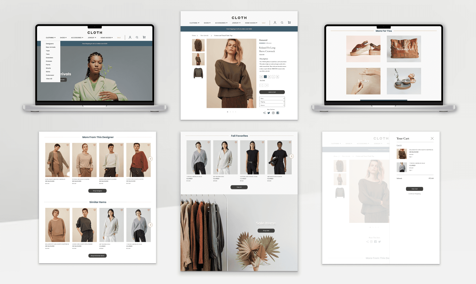
Below highlights layout enhancements designed to improve the overall user experience of the CLOTH e-commerce platform. The desktop prototype demonstrates the updated flow for browsing new arrivals, viewing product details, and completing checkout.
Below highlights layout enhancements designed to improve the overall user experience of the CLOTH e-commerce platform. The desktop prototype demonstrates the updated flow for browsing new arrivals, viewing product details, and completing checkout.
The impact
The impact
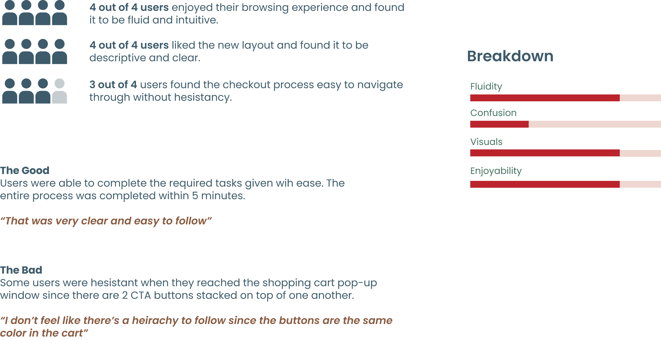
Usability test results
Usability test results
Retrospective
Retrospective
What I learned 💭
What I learned 💭
I learned that the design process is never ending and there is always room for improvement. Users also having visual guidance to follow in order to complete their tasks, but when presented with too many options they can get confused. Less is more, but make sure it is descriptive and clear.
I learned that the design process is never ending and there is always room for improvement. Users also having visual guidance to follow in order to complete their tasks, but when presented with too many options they can get confused. Less is more, but make sure it is descriptive and clear.


